Concept, Logo Design, Branding and Art Direction
by Luis Alvarez
August 2016
Task.
To fully rebrand the leader ticket sales company in Central Mexico.
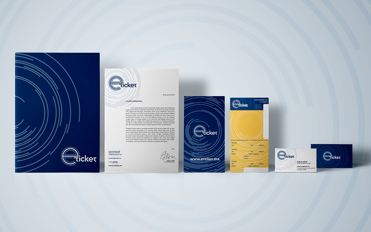
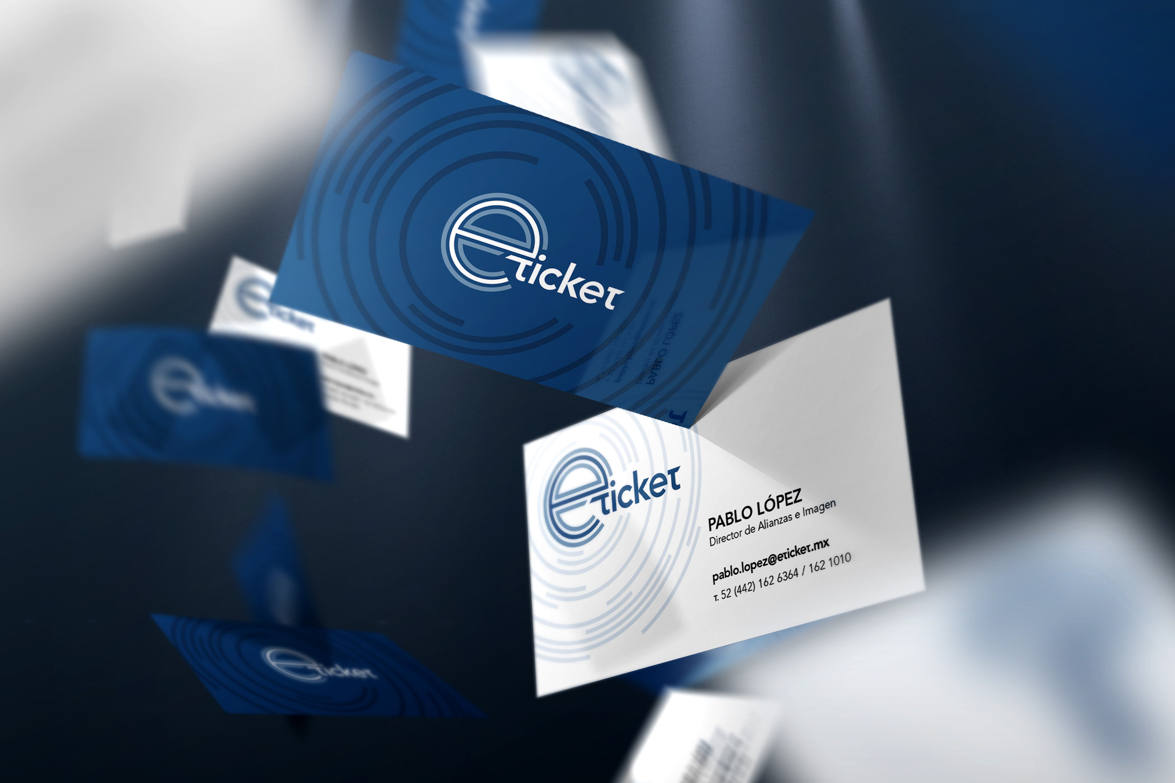
Project.
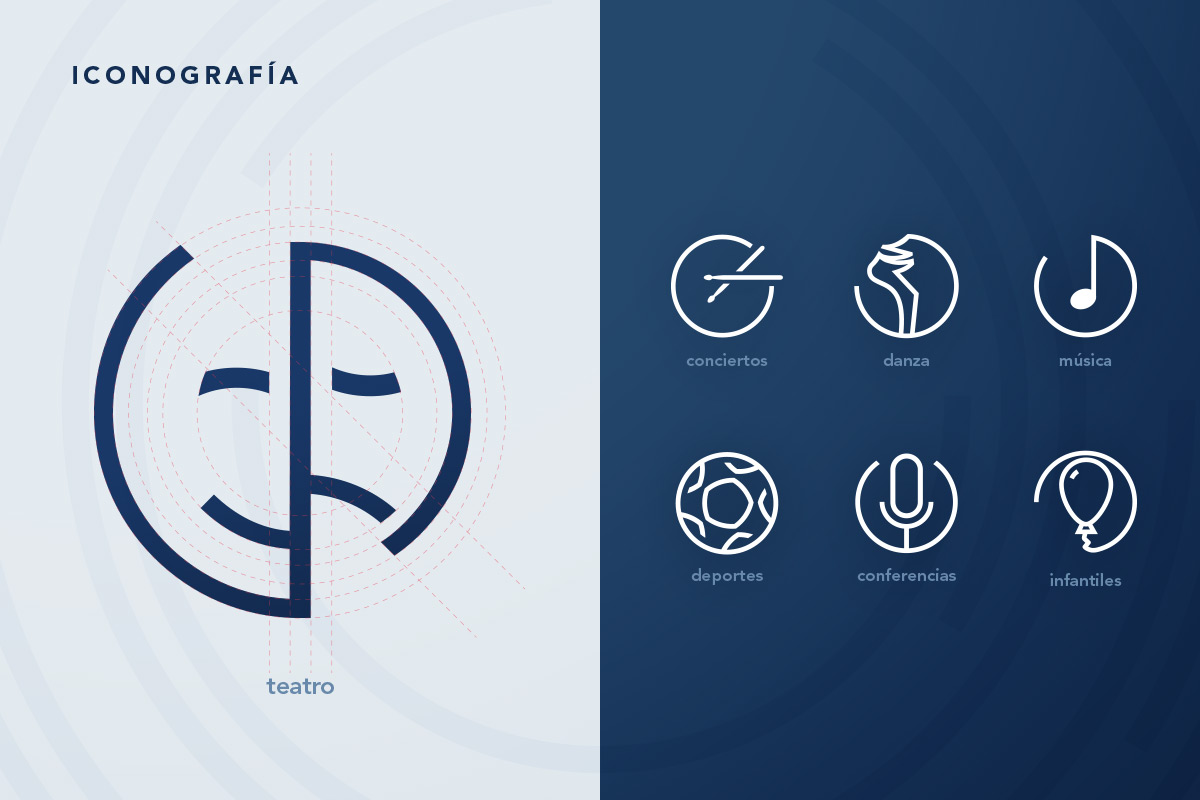
The ‘e’ was to be kept as the core part of the brand. I made that visually obvious, using the expansion of sound waves, that the brand itself is literally constantly expanding.
Result.
Through the sub-logo system created by a very strict grid system, the new brand looks fresh, modern and solid, stepping aside from its competitors and making a statement of knowledge and experience.